The project itself :
Project Overview
During a 10-week UX studio collaboration with Google Nest, our team redesigned the thermostat experience across both embedded hardware and mobile platforms. We explored three tailored design systems—Conscious Minimalist, Uncompromising Geek, and Unwilling Employee—each addressing distinct user mindsets while maintaining a consistent foundation for navigation, scheduling, and core controls.
Problem:
The Nest thermostat experience didn’t adapt to different user types, and hardware and mobile interfaces felt disconnected, making it hard for users to track energy use, manage schedules, and stay engaged.
Goal:
Create a cohesive, cross-platform thermostat experience with three persona-driven directions.
My role:
UI Desinger
Responsibilities:
Defined three persona directions and shared cross-platform flows with a team of four.
Conducted user research and journey mapping to understand each persona.
Created prototypes for hardware and mobile.
Iterated designs based on feedback to improve accessibility and usability.
Prepared design specs to deliver a cohesive, cross-platform system.
All about the user :
User Research
Falcon’s Nest — Master Your Environment
To inform our concepts, we first mapped how users interact with thermostats across hardware and mobile. Our team researched three archetypes—Conscious Minimalist ,Uncompromising Geek, and Unwilling Employee—and defined shared flows for home, scheduling, and menu screens on both the Nest device and app. I then led the Falcon’s Nest direction.
Target Audience
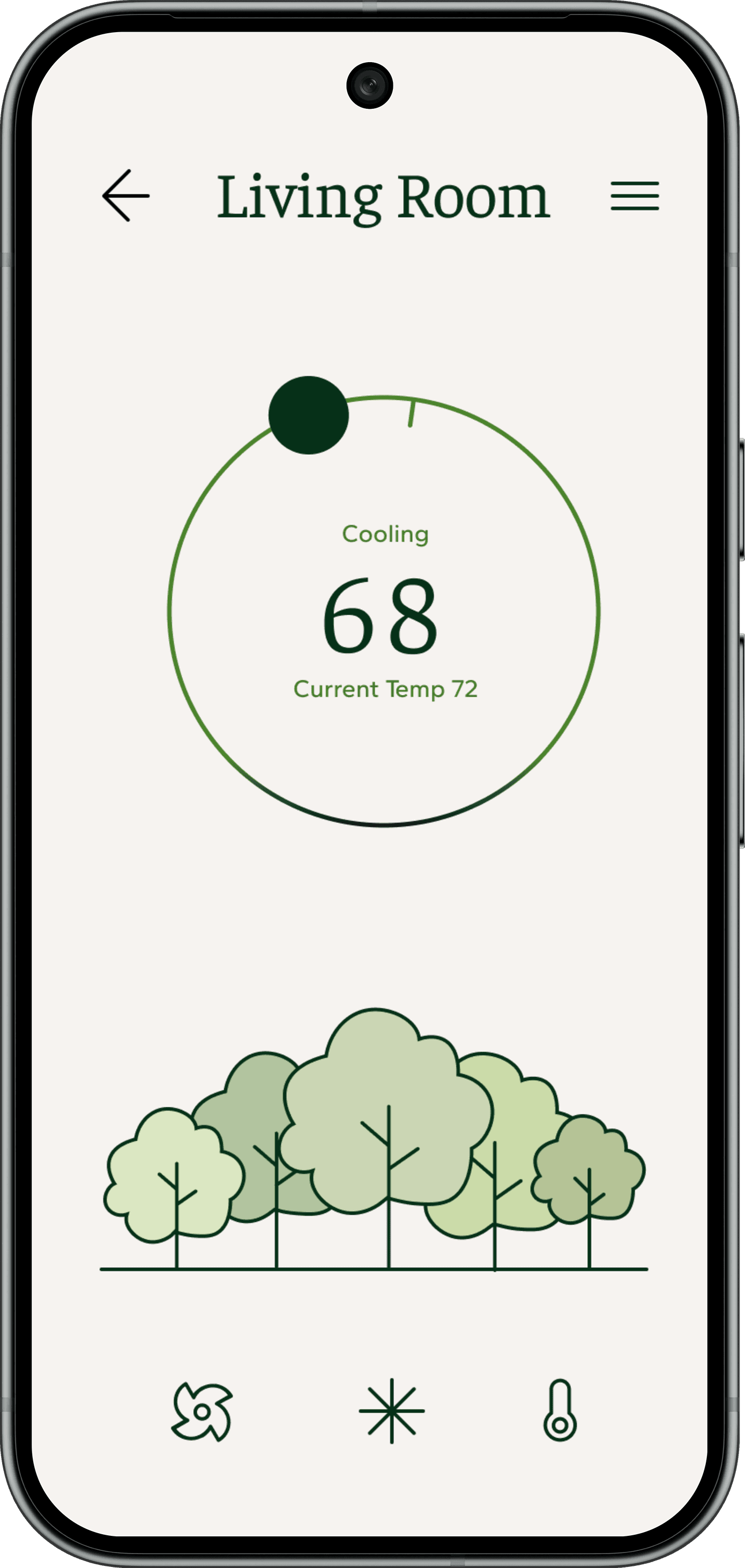
Conscious Minimalist → Sparrow’s Nest
Prioritizes sustainability and calm, seeking simple controls and clear feedback on energy impact.
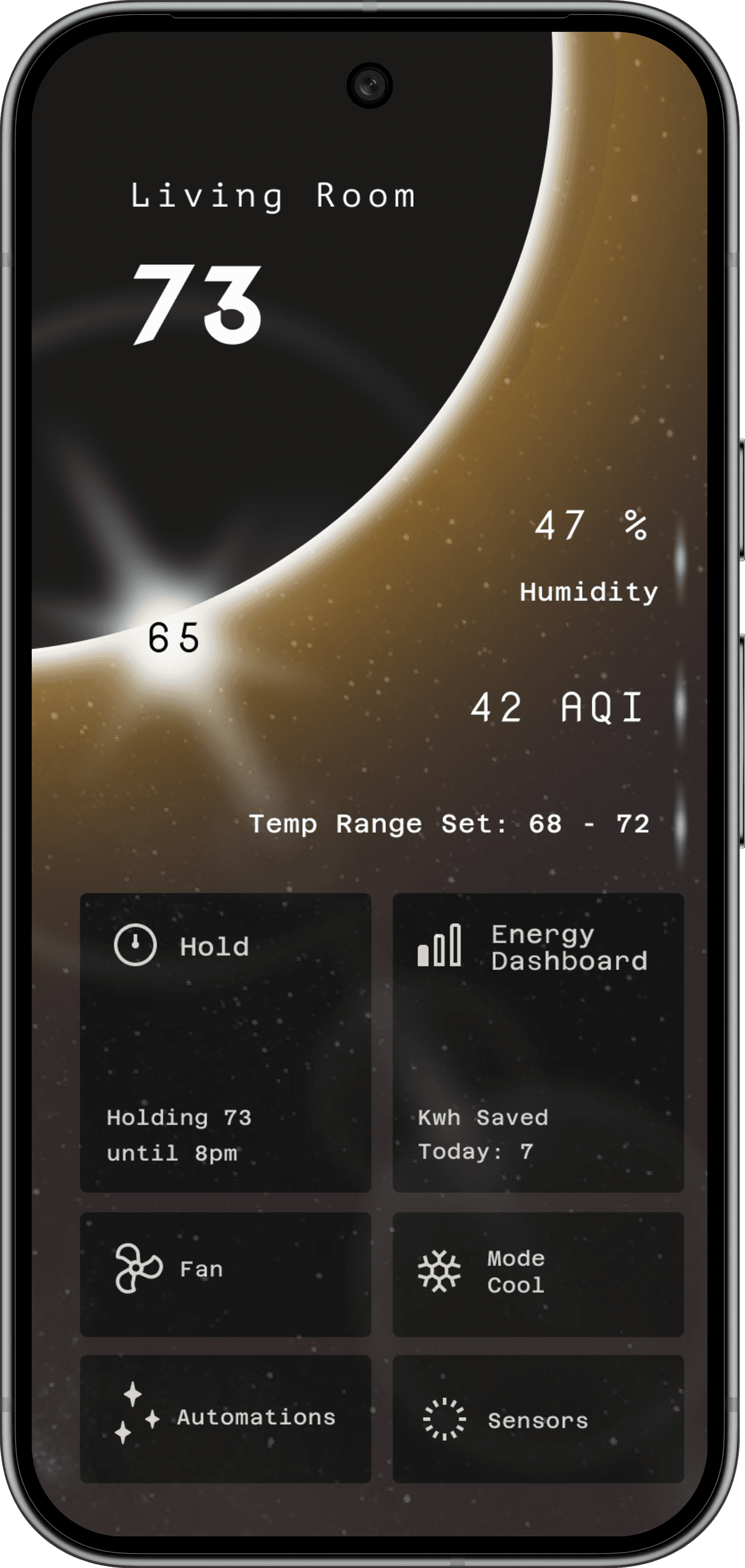
Uncompromising Geek → Falcon’s Nest
Values data, precision, and advanced customization options.
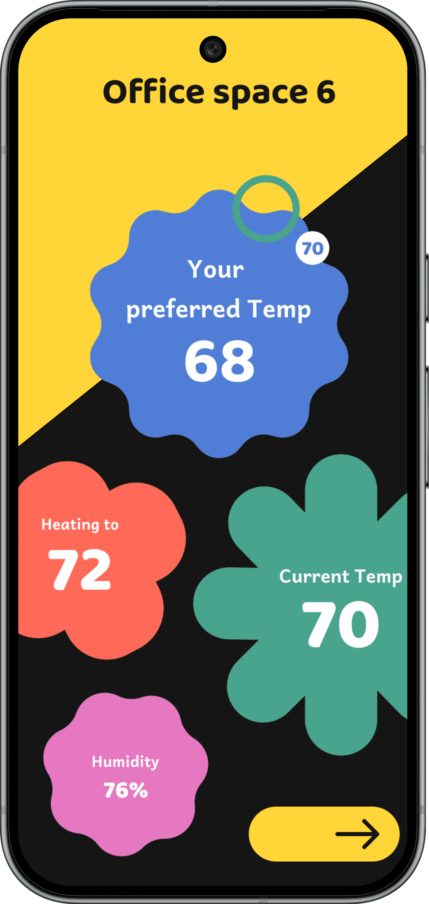
Unwilling Employee → Robin’s Nest
Low motivation, requiring playful, effortless interactions.
Pain Points
Persona Gaps:
A single interface couldn’t meet the needs of minimalists, power users, and low-effort users. Each persona required different levels of control, data, and visual complexity.
Disconnected Experience:
Hardware and mobile interfaces felt fragmented, leaving users unsure which device to use, especially when managing multiple rooms.
Hidden Energy Impact:
Users had difficulty understanding how their temperature and scheduling choices affected energy consumption and costs, making it challenging to form sustainable habits.
Key Journey- Uncompromising Geek
For Falcon’s Nest, I focused on a core journey: a power user configuring their thermostat to optimize comfort and efficiency with precise control and real-time data insights. This journey informed the flows and states for both hardware and mobile interfaces.
Goal
Enable users to optimize comfort with streamlined, capable, and innovative controls.
Actions
Adjust temperature and schedules with precision, monitor performance and energy efficiency, and customize advanced settings across rooms.
Feelings
Confident, empowered, and in control of their environment.
Opportunities
Deliver polished, efficient interfaces with innovative features, clear feedback, and seamless cross-device interactions for precision-focused users.
The clear version :
Design
Here I created a static, high-fidelity Suplan app design (keeping in mind all the conclusions from the previous phase of usability studies) that is a clear representation of a final product called design mockups.
After that, I created a high-fidelity prototype of the app.After that, I created a high-fidelity prototype of the app.
Rapid Prototyping
I created low- to mid-fidelity prototypes for Falcon’s Nest—covering room view, Menu/performance summary, and Schedule editor—to test streamlined, precise controls and advanced interaction patterns before final visual polish.
User Testing
After establishing the Falcon’s Nest visual direction, we ran usability testing across the Static view, Menu, Schedule, and the physical dial interaction. Participants completed core tasks—checking energy performance, editing a room schedule, and adjusting temperature—while thinking aloud about clarity and ease of use.
Navigation cues were unclear. Users relied on visual intuition rather than explicit signals, leading to uncertainty about how to access scheduling or change temperature states.
Visual hierarchy caused overload. On the static view, glowing accents, temperature readouts, and decorative elements competed for attention, making it difficult to immediately understand system status.
Collapsing sections lacked affordance. Users did not instinctively recognize expandable areas, indicating the interaction model was not visually legible.
Information density exceeded glanceability. On secondary screens, overlapping visual layers and controls slowed quick scanning, especially for infrequent tasks like scheduling.
Refining & iterating
Using our usability insights as a guide, I stepped back to refine the visual system as a whole—returning to a new moodboard and exploring the moon as a unifying form to improve clarity, hierarchy, and calm.
Revisited the overall visual language instead of applying isolated screen-level fixes.
Built a new moodboard to reset form, tone, and visual restraint.
Explored the moon as a primary shape to create a single, calm focal point.
Reduced visual competition by simplifying glow, contrast, and layering.
Clarified collapsing behaviors and interaction states.
Improved glanceability while preserving Falcon’s Nest’s premium, atmospheric feel—especially on hardware interactions.
Reworked typography, color palette, and iconography in response to testing feedback around legibility and visual overload.

65
47
42
Humidity
Air Quality
Holding 73 until 8pm
Kwh Saved Today: 7
Azeret Mono
Nova Mono
The project schematically :
Final Prototype
The final prototype brings together the thermostat’s Static, Menu, and Schedule views with the companion mobile screen into one cohesive, end-to-end experience.
The project schematically :
Outcome
By the end of the project, we delivered a three-direction Nest ecosystem that functions as a single, cohesive product family: Sparrow’s Nest for conscious minimalists, Falcon’s Nest for data-driven users, and Robin’s Nest for more reluctant adopters. While each direction expresses a distinct visual language and level of complexity, they all share the same core flows, components, and cross-platform behaviors. Sparrow’s Nest demonstrated how a restrained forest metaphor and calm visual system can make energy impact feel meaningful and understandable—without relying on dense charts or overwhelming controls.


