


The project itself :
Project Overview
During a 10-week SCAD collaboration with Porsche, we designed a next-generation in-vehicle experience for future electric vehicles. We reimagined the digital ecosystem across the instrument cluster, center display, and companion app to clarify EV-specific information, reduce range anxiety, and maintain Porsche’s performance-driven character.
Problem:
Drivers new to electric vehicles often face unclear feedback around range, charging, and performance. In Porsche’s case, this can lead to range anxiety and a digital experience that feels less aligned with the brand’s driver-focused identity.
Goal:
Design an integrated HMI that gives Porsche EV drivers clear, at-a-glance insight, supports confident trip and charging decisions, and reinforces the brand across in-vehicle and mobile experiences.
My role:
UX Designer focused on research, testing & prototyping
Responsibilities:
Conducted competitive teardowns, ride-alongs, and safety research.
Ran in-person and Maze usability testing
Synthesized insights to guide UX decisions.
Contributed wireframes for cluster, infotainment, and mobile.
All about the user :
User Research
Collaborated with the team on EV HMI benchmarking, interviews, surveys, and forum research to understand how Porsche EV drivers plan trips, manage charging, and use companion apps. Contributed to research synthesis for the infotainment and mobile experiences, ensuring interaction and motion decisions were grounded in real driver needs.
Pain Points
Fragmented trip planning:
V drivers rely on multiple apps to plan routes, charging, and costs without one clear, connected view.
Low confidence in range and charging data:
Unclear estimates and unreliable charger info make drivers question whether they’ll reach their destination smoothly
Tech experiences that weaken brand trust:
Laggy or inconsistent digital tools risk distracting from Porsche’s performance-driven identity.
Target Audience
Our research centered on three EV buyer segments to ensure the experience resonates with both tech-forward newcomers and long-time Porsche owners.
Primary Audience:
First-Time Porsche Buyers
Secondary Audience:
Existing Porsche Owners Exploring Electric Models
Tertiary Audience:
EV Owners Outside the Porsche Ecosystem
Research Methods and Testing
Before wireframing, we analyzed Porsche’s cockpit experience through research and testing, using the findings to shape a validated information architecture that guided the design.
We conducted a competitive analysis of Tesla, Lucid, Mercedes, and Audi to understand how leading EV brands approach in-car navigation, charging, and driver focus.
Goal
The goal was to identify patterns, gaps, and opportunities to inform a Porsche-aligned information architecture.


The project schematically :
Starting the Design
Here I built some schemes and storyboards to clarify and understand information and architecture of the app. After I created paper wireframes and than proceeded with building digital wireframes with a low-fidelity prototype in order to conduct usability studies with stakeholders.
Site Map
It's a structured scheme that outlines the pages and content hierarchy of the app.


84%
Direct Hit Rat:
The updated information architecture increased findability by 130% in the final Maze test.
50%
Depth Reduction:
Settings depth was reduced by half, making features easier to find.
≤ 2Taps
Driver-critical tasks were limited to two taps or less.
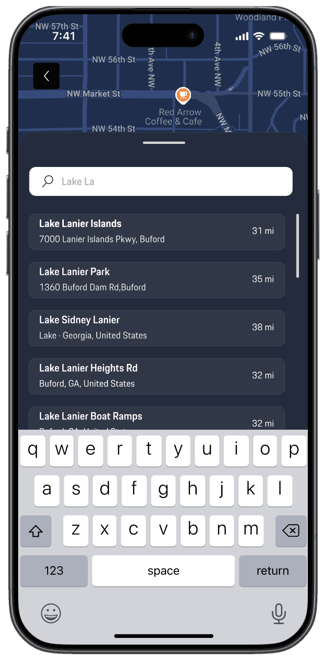
Mobile App: Trip Planner Flow
Mapping the EV journey before visual design
I redesigned the end-to-end My Porsche trip-planning flow, focusing on pre-departure planning as a high-impact but fragmented experience. From low-fidelity sketches to Figma wireframes, I created a single, continuous flow that lets drivers plan, send, and track trips without navigating complex menus, guided by driver-first clarity, personalized performance, and ecosystem consistency.

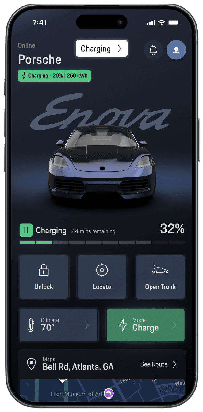
Infotainment Wireframes
Defining the core layouts and states for the in-car system.
Using the validated IA as a foundation, I collaborated with the in-car team to define key screens such as the driver home, app launcher, route selection, and cabin controls. The wireframes feature a persistent IA dock and a cross-domain dashboard that surfaces navigation, energy, and media at a glance, ensuring alignment with the Trip Planner and overall EV ecosystem.
Usability Studies
This is an examination of users and their needs, which adds realistic context to the design process.
To validate the experience beyond visual polish, I supported five rounds of usability testing with 32 participants, blending an in-person cockpit rig with remote Maze studies. For the mobile Trip Planner, we evaluated task completion, error rates, and SUS benchmarks. The final testing rounds achieved SUS scores of 86.5 for the mobile app and 74 for infotainment and cluster—well above the industry baseline of 68 demonstrating a smoother, more confident EV planning experience from phone to vehicle.
Improved task efficiency:
Refinements to the information architecture and end-to-end flow increased task completion to 96%, while reducing mis-taps and overall time-on-task across critical Trip Planner actions.
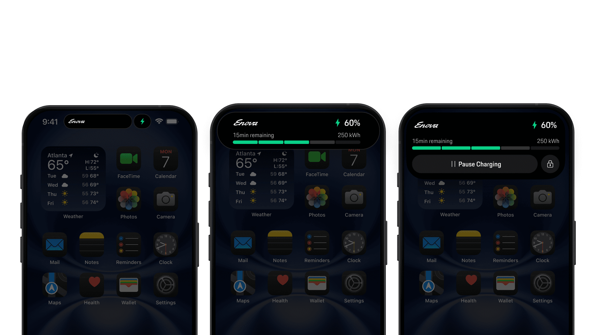
Greater confidence in range and charging
Clear arrival-battery indicators and live trip card feedback reduced range anxiety, with participants expressing confidence in reaching destinations and understanding charging requirements.
One cohesive Porsche ecosystem
Consistent interaction patterns and visual language across the app, PCM, and cluster created a unified experience, reinforcing brand trust and eliminating the feeling of disconnected touchpoints.
The clear version :
Refining Design
In this step, I created static high-fidelity design mockups that represent the final app experience, defining the visual language, layout, and interaction intent.
High-fidelity Design
These are a high fidelity design that represents a final product
The final Trip Planner was delivered as a fully interactive ProtoPie prototype, bringing the end-to-end flow to life with realistic interactions and transitions. Built from Figma components, the prototype uses tap and scroll behaviors, timeline-based animations, and clear state changes—such as charger selection and “send to car” confirmation to reflect the intended production experience.
Home
→
Search Destination
→
Route Overview (fastest pre-selected)
→
Send to Vehicle
→
Live Trip Card
→
Charging Overview
Home
→
Search Destination
→
Route Overview (fastest pre-selected)
→
Send to Vehicle
→
Live Trip Card
→
Charging Overview

Home
→
Search Destination
→
Route Overview (fastest pre-selected)
→
Send to Vehicle
→
Live Trip Card
→
Charging Overview


Home
→
Search Destination
→
Route Overview (fastest pre-selected)
→
Send to Vehicle
→
Live Trip Card
→
Charging Overview

The project schematically :
Outcome
Now, finally, it remained to pay attention to several takeaways and plan some further steps.
Takeways
Key results for drivers, Porsche, and the overall product ecosystem.
Impact:
A clearer IA, focused Trip Planner flow, and defined cockpit modes reduced friction around route planning, range understanding, and feature discovery. Mobile, center display, and cluster now work as one cohesive EV ecosystem, allowing drivers to plan and drive with greater confidence.
What I learned:
This project reinforced that structure comes before styling. Solid IA and flows made visual and motion decisions more effective, while a shared system ensured consistency across screens.
Next Steps
Extend Trip Planner to better support everyday EV use, not just long trips.
ntroduce adaptive intelligence that learns driver habits and personalizes guidance over time.