Duration
10 weeks
Tools
Figma
Duration
10 weeks
Tools
Figma
The project itself :
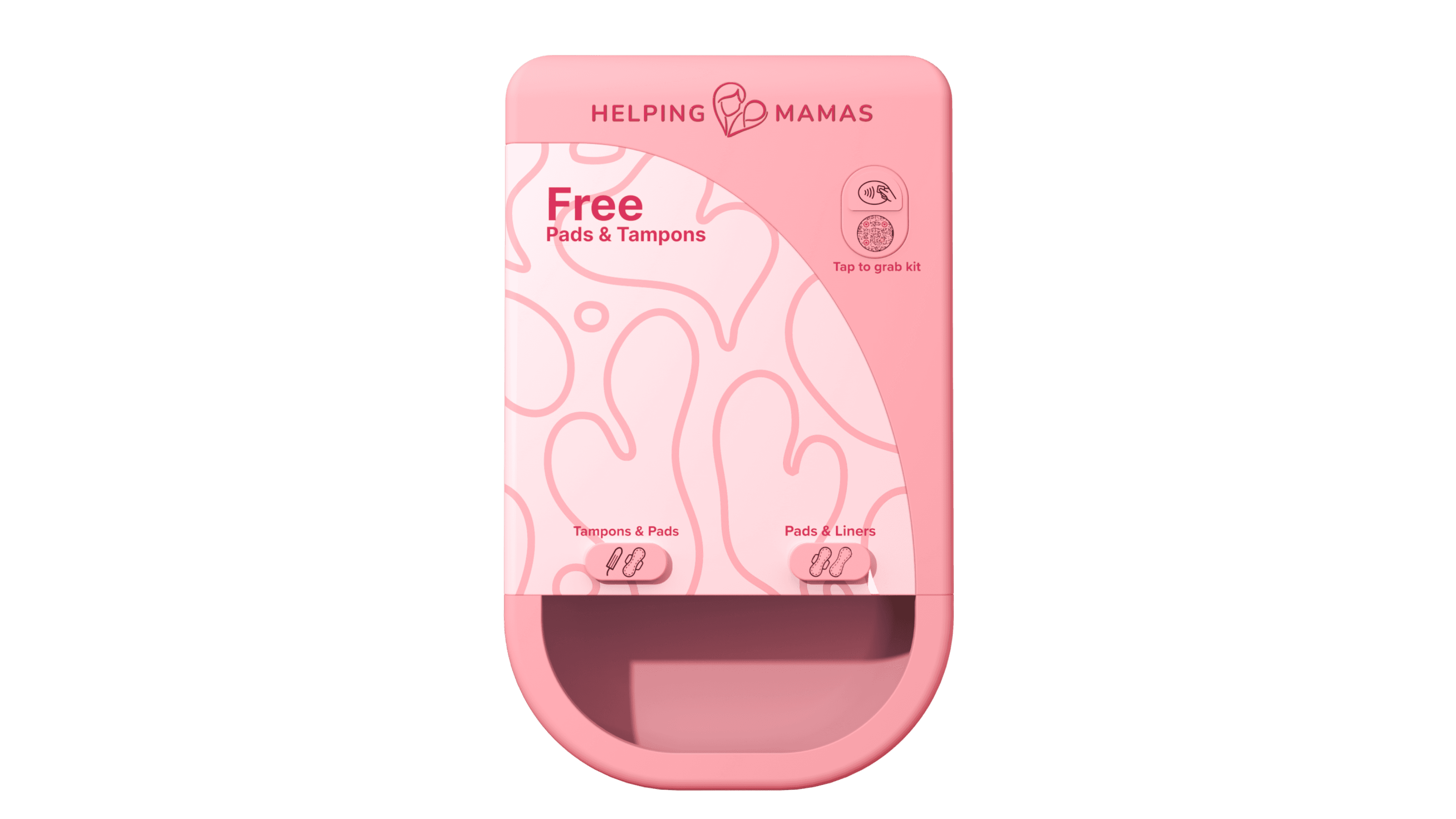
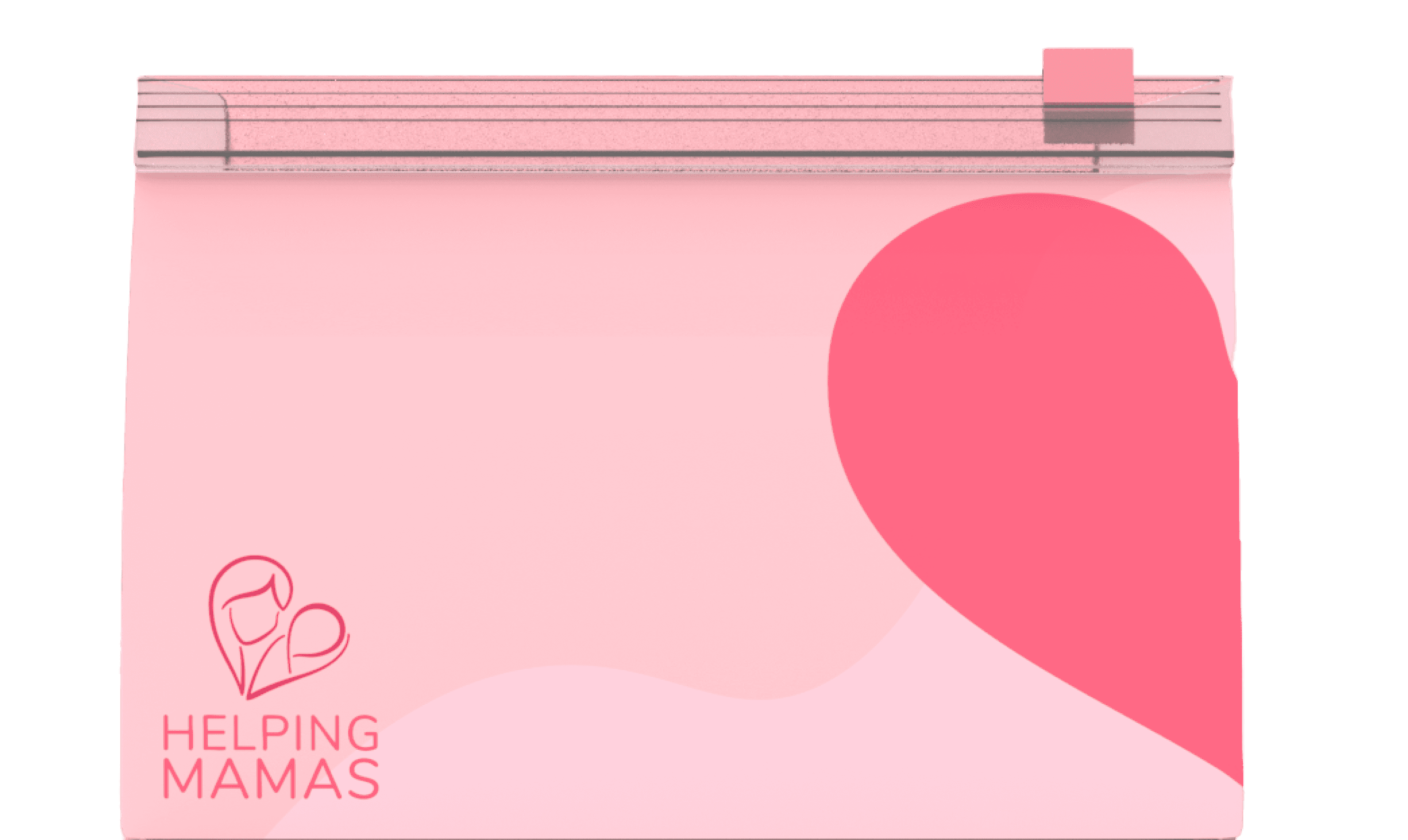
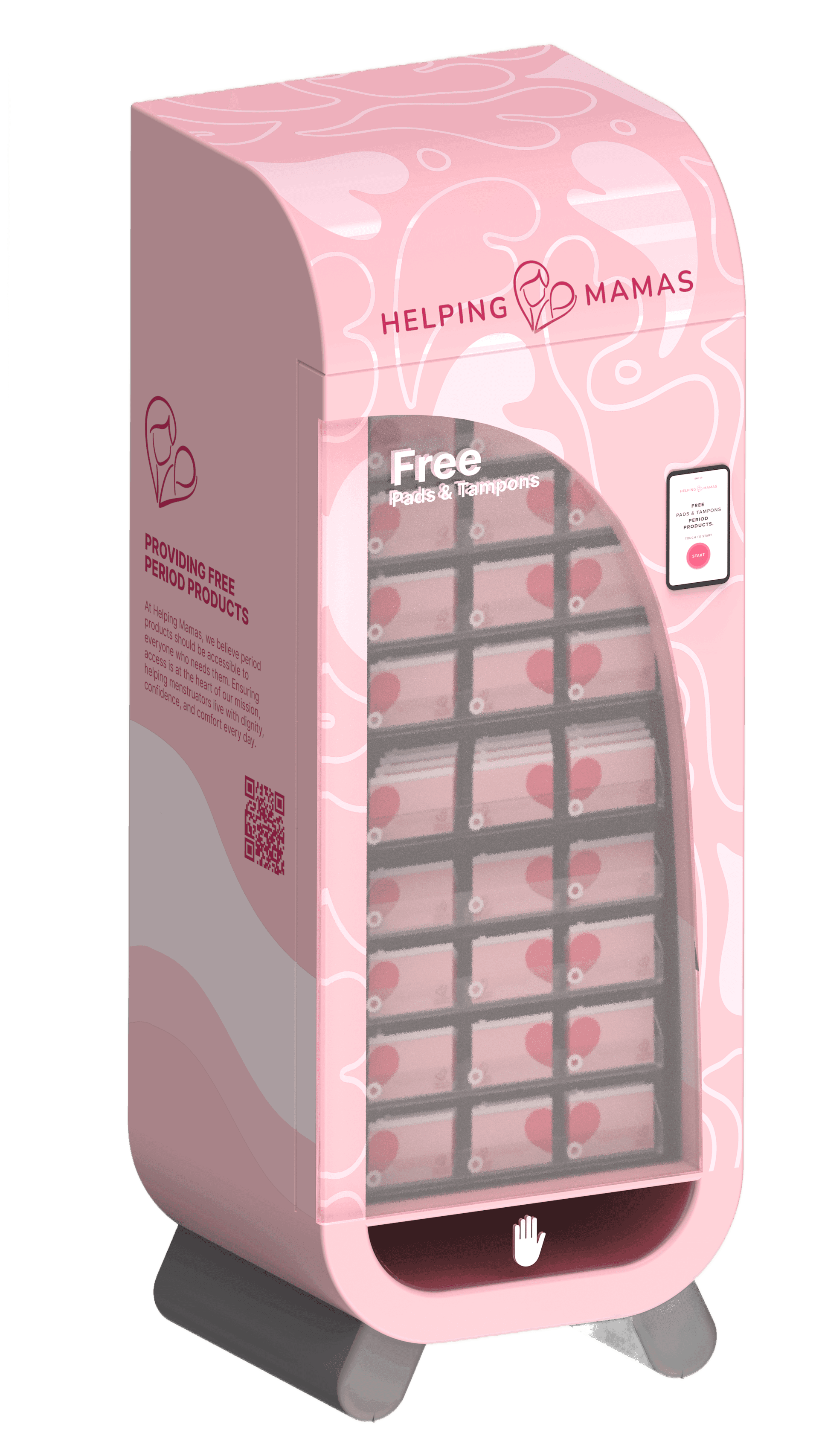
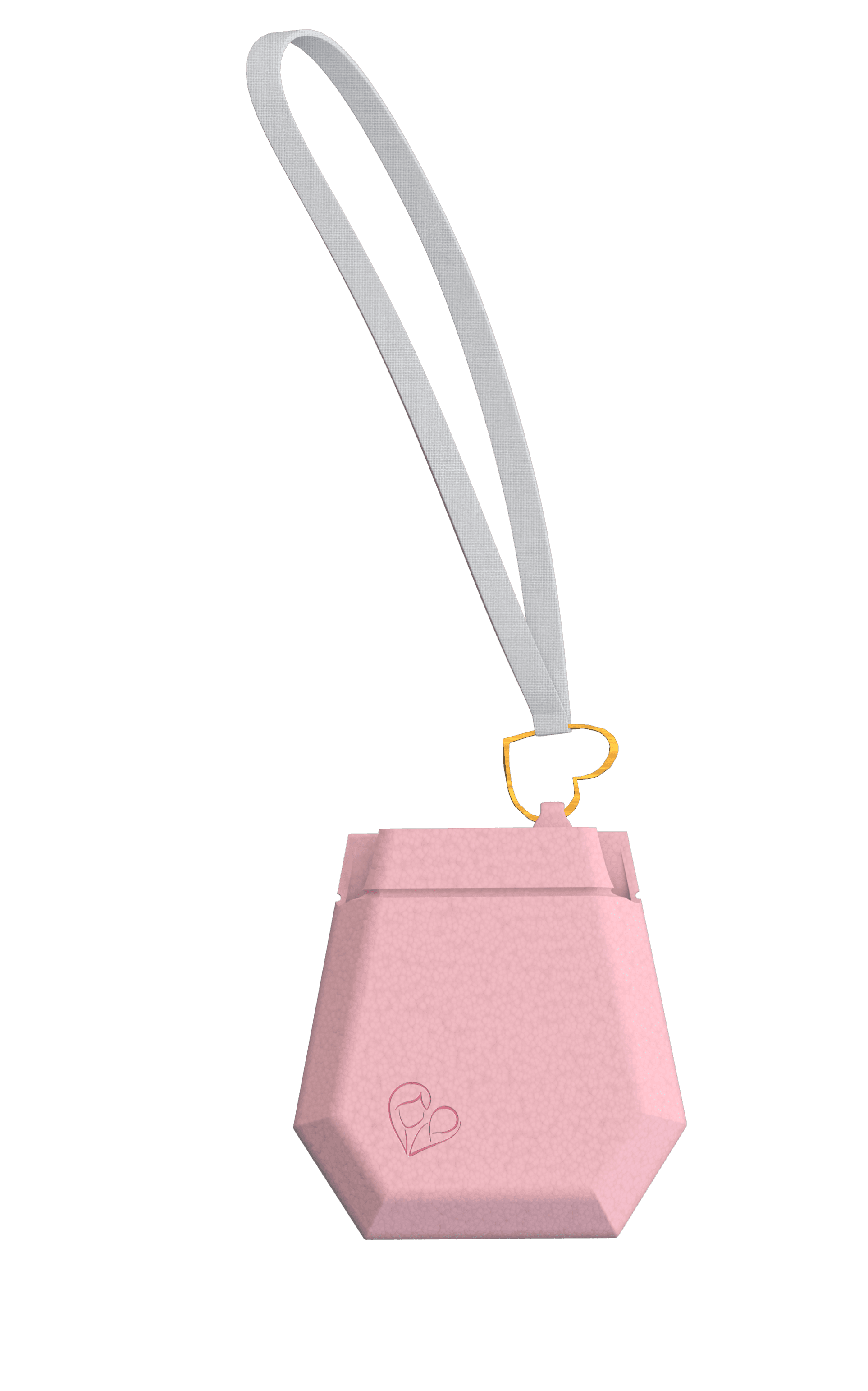
The Helping Mamas dispenser ecosystem is a physical product system designed to address period poverty by providing safe, private, and dignified access to menstrual care. Placed in schools and community spaces, the system combines a modular dispenser, access card, and thoughtfully designed packaging to ensure essential supplies are available without stigma or friction.
Period poverty limits access to essential menstrual products, forcing many girls and women into uncomfortable and undignified situations. Existing solutions often lack privacy, clarity, and emotional sensitivity at the moment of access.
Create a dignified, compact, and adaptable solution that distributes products while raising awareness, rethinking packaging, and extending access beyond the machine.
UX Designer contributing across the full physical product ecosystem, including interaction design, system flows, and experience strategy.
Touchscreen interaction design
Ecosystem experience
User journey mapping
Defining access and verification flows
Crafting empathetic microcopy
All about the user :
Research focused on understanding how access, stigma, and maintenance affect real-world use of menstrual care systems. Insights were gathered through 60+ interviews, 100+ articles, and 20 site visits, revealing that dignity, privacy, and reliability are just as critical as product availability
Period products are often unavailable when and where they’re needed.
Fear of exposure discourages users from accessing available support.
Refill burden and poor maintenance reduce long-term effectiveness.
They were selected by conducting user research and identifying common pain points, that frustrate and block the user from getting what they need from a product.
These five pillars guided every design decision across the physical and digital ecosystem.
The project schematically :
I began by understanding the full ecosystem. by mapping user journeys, system touchpoints, and constraints across access, privacy, and maintenance. This helped align the physical dispenser, touchscreen interactions, and supporting elements around a single, dignified experience.
This project was designed as a physical ecosystem, not a standalone machine.
Every component supports the same goal: dignified access, privacy, and trust at the moment of need.
This is used to map the emotional and physical journey of accessing menstrual care in public spaces, helping us design each moment with clarity, privacy, and dignity.
The storyboard illustrates the full journey. From discovering the unit and exploring options, to tapping the access card, receiving a kit, and carrying it away with privacy and dignity.
The system’s key features were designed to ensure ease, empathy, privacy, and reliability across every interaction.
Tap-based access minimizes steps and removes friction at the moment of need.
Smart tracking helps monitor usage and refills, ensuring products are consistently available.
A flexible system that adapts to different spaces, capacities, and community contexts.
An approachable, non-clinical design language that prioritizes comfort and emotional safety.
A consistent visual and physical language across all components to create trust and familiarity.
Multiple modular configurations allow the system to scale across spaces and contexts.
in it.
The Four different unit sizes were informed by research into real spaces, usage volume, and maintenance needs, allowing the system to adapt to hallways, restrooms, schools, and large community hubs.
The clear version :
On this step, first I created a static, high-fidelity Voo's app design (keeping in mind all the conclusions from the previous phase of usability studies) that is a clear representation of a final product called design mockups.
After that, I created a high-fidelity prototype of the app.
These are a high fidelity design that represents a final product
I created all the app pages mockups, incorporating the right design elements such as typography, color, and iconography. I also included captivating and visually appealing images, and developed all the necessary components and elements.
The goal was to demonstrate the final Voo's app in as much detail as possible.
A series of campaign posters created for Helping Mamas that communicate the organization’s mission through bold messaging, cohesive illustration, and a unified color system—designed to make issues of access, dignity, and support immediately visible.
The project schematically :
The project resulted in a self-service distribution kiosk concept that simplifies access to essential care kits while maintaining dignity, clarity, and fairness for users. The final solution balanced system constraints (kit limits, verification) with empathetic design, ensuring users always understood what was happening and how to get help when blocked.
The project reduced friction and confusion in accessing care kits, creating a clearer, more dignified self-service experience for families while supporting fair and efficient distribution.
I learned how service design can directly support social impact, and gained a deeper understanding of period poverty. Its stigma, systemic barriers, and the importance of designing access with dignity, clarity, and empathy.
Pilot test the kiosk with real users in partner locations to validate clarity and emotional response.
Refine the support flow by integrating clearer guidance and faster access to human assistance.


